Worship Tech Web Tools Blog
 This is an ongoing blog of web tools and technology related to worship, music and church. The idea is to give you good web points and resources that you can go to. Some of it is just me cruising the net, others are favorites of friends.
Enjoy what you see here. If you find an interesting, useful and technology related site or resource that deals with helping worship or musicians in general, please send us a note and we will check it out. Perhaps we can feature it here.
Thanks!
Enjoy! - Kim Gentes
Entries in mobile (6)
For the Love of Code: jQuery Mobile Finally Here (Kim Gentes/Worship Tech Blog)
 Monday, November 28, 2011 at 4:20PM
  If you are in the world of web or app development, the proliferation of devices and platforms in the last few years has been the bane of your existance. Just when we thought there was 2 browsers taking the hill, 3 more stand up. Now, the field is mashed into 4 very competitive browsers - IE, Firefox, Chrome, Safari (and smaller but still strong in mobile, Opera). Alongside the browser flattening (from just IE/FF), OS platforms have exploded, again especially on the mobile side. The main proliferations are iOS, Android and Symbian, with some revs of Windows and Blackberry chewing up the remainder of users.
So here is the deal. All those browsers and platforms have changed so significantly, that the underlying technologies have become a mashup of mobile centric functionality (such as touch-screen operation, screen resolution/orientation), HTML5 A/V capabilities and desktop CSS sensibilities (along with web font assets etc). A modern mobile phone has a unique dialect for browsing websites and using its hardware and accessing the datastreams it connects to- notably digital cell phone calls and internet surfing. Dumbing down the desktop versions of HTML and browsers into a mobile version is no longer an option. iOS and Android (both webkit-based) browsers have forced us to see the world of mobile as unique. In fact, it has pushed back much of the simplicity and elegance demanded of mobile devices back onto the design of desktop via what I call the "iPhonification of websites". We are seeing web 2.0 (and 3.0) largely with the flavor pushed back onto the desktop world from the success of Apple's mobile i-world.
OK, so that is the set up. Once we see the mobile world has its separate needs and reasons for requiring a different technology subset, we recognize that perhaps we need a different way of architecting these mobile browser experiences. For the last 3 years, much of the desktop AJAX experience has been fueled by support from a toolsuit called jQuery. Free, but brilliant and solid software modules that provide a framework for AJAX/Javascript development and function. And, up until now, people developing for mobile have been cramming jQuery solutions into mobile devices to stay consistent with their server side support.
Life just got a bit clearer. About 10 days ago, the version 1.0 of jQuery Mobile finally released. Initially, this will actually make more work for those software developers who want to support all the platforms that are continuing to proliferate onto the marketplace. But with the creation of this unique mobile version of jQuery, hope rises for the huge range of sites/apps that rely on jQuery as their mobile solution for an AJAX foundation.
The new jQuery Mobile stands on top of (not in place of) the jQuery core, and reaches into various areas, most notably the touch functionality. Everything from attribute references to PhoneGap update tips are included on jQuery Mobile's flourishing documentation. Everyone in the app/site space is rushing to support mobile, but none of that is possible (in a good long term way) without platform tools like this being brought to bear in the mobile space.
All you geeks out there can check out jQuery Mobile for yourselves right here.
A big shout out to all the folks in the jQuery cloud that make it all happen.
Kim Gentes
Windows Phone: Intuitive, Simple, Brilliant. (Jordan Gentes/Worship Tech Blog)
 Thursday, November 17, 2011 at 10:53PM
 Editor's Note: This tech blog entry is made by Jordan Gentes, a cell phone expert who is also a web support technician for WorshipTeam.com. Jordan has spent years studying phones, from various companies, carriers and plans and the depth of cell networks and technologies. When he says something about cell phones, I listen, because he is speaking from more experience and knowledge than anyone I know on the topic. ---Kim Gentes, Editor
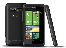 Windows Phone 7.5 Review
HTC Trophy
by Jordan Gentes
Microsoft’s new phone platform Windows Phone7.5 is intuitive, simple, and brilliant. Wait, did you just use those three words in the same sentence as Microsoft and Windows? Yes, I did. This new development by Microsoft brings an important piece to the mobile environment.
Intuitive: The OS its-self is very intuitive. When you power on the display you are welcomed to live tiles that are beautiful and easy to understand. Gone are the days of cluttered notification bars and crowded clusters of apps. Windows Phone ushers in a day of relevant information that updates seamlessly.
- People: The ability to sync your contacts with external email accounts and Facebook are standard in the “smartphone world”. Some phones settle for simply syncing photos and other contact information. Windows Phone goes to the next level with a deep Facebook integration. Now I can locate my contact in my People section and I am presented with the contacts’ Information, What’s New (On their FB wall, statuses, posts etc.), Pictures (feed from FB), and the History I have with that contact, from Texts, to missed calls, all of my interaction with that contact is stored in an easy and convenient location.
Simple: With the introduction of live tiles the Windows Phone OS is super simple to navigate. The OS is attractive to all ages, something that neither iOS nor Android can say. This OS provides an enjoyable user interface that is simple, but powerful.
- Messaging: Windows Phone has done a great job consolidating text and Facebook messaging into a convenient and seamless process. You can start a conversation with someone via text and continue the messaging on Facebook if they were to login while you were in conversation or vice versa.
Brilliant: Windows Phone is brilliant; so many functions that users count on daily are built into the framework of the user experience.
- Windows Key: Probably one of my favorite features of the OS, hold the Windows Key, for two seconds and you are greeted with options to speak commands to the phone. Texting, Searching, and launching apps are just a few of the options that are made possible by this feature. And what do you know, it works! If you speak clearly, it will understand the overwhelming majority of what you are saying, I have yet to say something clearly and have it misunderstand my instructions. Try that Android..
- E-mail: I love the email client on the Windows Phone OS. You can add most popular email services to sync with your phone. This is a great thing for the user; I can’t tell you how frustrating it is that you can only sync Gmail (other than Exchange) with Android. Microsoft’s decision to allow their users to sync Yahoo, Windows Live, or Gmail is very pleasing.
- Search: When you click the search button, you are greeted with more than just a traditional search. Built into the “Search” is 4 icons at the bottom of the screen, one that finds local attractions near to your location, a music note that within seconds of touching finds your song (bye, bye Shazam), an eye ball that scans barcodes, QR Codes, Microsoft tags, Books, CD’s and DVD’s. I love that they have taken the time to add those recourses to the Search, no more need for 10 different apps to perform the various functions. It’s clean, and it just works!
- Apps: While the Marketplace for Windows Phone continues to grow, it is certainly newer to the market then iOS or Android. With that “new comer” status there are less apps available. However, due to the deep integration of features already provided in the OS I found my need for additional apps to be much lower. Nonetheless, I found most popular apps available on the other platforms were available one Windows Phone. To be frank, I found all the apps I wanted to use were available, however, to be fair I did want to mention the reality that the app selection is not as populous at this moment on Windows Phone.
Synopsis:
 This particular review was conducted on an HTC Trophy, however, yet another thing I love about Windows Phone is every phone gets updates, meaning everyone has a congruent user experience. The battery life on this particular device is incredible (for a smartphone) I easily go the entire day with no problems. On one day of very heavy usage I got a low battery warning at 15 hours, however, on a normal usage day (that would involve several emails, 100-150 text messages, 30 minutes on the phone, and some casual internet browsing) the phone still had 40-50% battery remaining at 15 hours. Battery usage will vary by device somewhat, however, the OS manages power quite efficiently. Windows Phone is a true representation of a modern mobile experience. Windows Phone is clean and it’s such an inviting user interface that I am confident anyone would enjoy the experience.
Amazon Product Link: HTC Trophy Windows Phone
 Kim Gentes |
  2 Comments |
 New Kindle Lights The Fire (Kim Gentes/Worship Tech Blog)
 Tuesday, November 15, 2011 at 3:18PM
  There is no denying it, Apple has been the uncontested monster at consumer devices in the last decade, with iPods, iPhones and iPads. With few flops, save the Apple TV (twice), Steve Jobs and co have led the revolution of simplicity and elegance on designed electronic goods. And frankly, they have opened up new markets that told the customers what they should have, instead of trying to make tweeks to the current world of electronics as they were. So that was the last 10 years. But now, with Jobs gone, what does the next 10 years look like.
Perhaps, not "more of the same", if Amazon has anything to say about it. In fact, with the launch of their latest device Amazon looks like they have finally decided to weigh in, and weigh in heavily, on the device market. Not satisfied with having the world's most popular ebook reader, Amazon has launched a new line of Kindle devices that compete head-on with real tablets. Here is my review of the first version of that device.
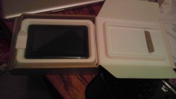 Today is November 15. It is a significant day for many other reasons, but one small reason is the arrival of the new Kindle Fire, personal tablet from Amazon. I had preordered the tablet for work reasons, but was anxious to get it open running as soon as the UPS man rang the doorbell.
The unveiling of my new Kindle Fire repeats a theme that has been taught well by Apple- simplicity. But Amazon takes this theme and perfects it, and expounds on its uses in a broader context. The shipping box containing the Fire was simple and well packed (all with eco-conscious packaging), as is most everything Amazon does in fulfillment.  Popping the box open revealed the device (and a small power chord) and a simple sleeve box top. Inside the sleeve was a simple paper card, containing literally 5 simple sentences of instructions. No monster guide, no thing "getting started" manual, just a single card with a big picture and less than a handful of words (which all fit, nicely, in my hand). User guide? Who needs a user guide- this is the new Kindle. OK. Prove it.
The device itself is all black (mine anyways) with just one physical button (power), a single USB connector/power port and a mini-jack for audio. All located at the base of the portrait-held device. There are shallow indentations at the top edge for the audio speakers. The back of the device is a grippy, rubberized cover. Nice tactile surface,  that doesn't slip from your hand and isn't rounded, unlike the iPad 1 whose rounded aluminum back was always slipping and pushing away from the user. Physically, the Amazon Fire form factor is literally 1/2 the size of iPad 1. However, the screen size of the Fire is only about 75% of height and 2/3 of the width, so you are still losing significant screen size, but it feels still large enough for use in your hands.
Booting it up, the Kindle Fire was ready to go by immediately powering up when I plugged it in. And the question to get going on the device quickly had me choosing a network and time zone.
Next came the fun surprise of seeing that the device recognized its owner without me doing anything. Presumably the device was tethered to my purchase account somehow, and immediately recognized who was the owner. Regardless of how this happened, the device customized itself to me and quickly loaded its updates and my own content connections.
On first opening of the device, initial "welcome" guides show how to use the basic functions of the device. In two or three easy arrows I was ready to run and rock with my Fire.
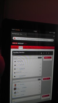 Quickly, I jumped around to see all my kindle books (from my previous purchases of kindle books on the iPad app), all my audiobooks and Amazon cloud music was all available on this device. Some initial download time would get content, but all was accessible without extra logging in or such. Love it.
I quickly went to the web browser and walked through a number of sites, including our favorite, WorshipTeam.com. The Kindle Fire performed excellent on all fronts. Websites with HTML5 and Flash worked perfectly and the performance was snappy. Battery seems to be charged close to top when you get the device, but I topped it off. After five hours of playing media and websites and even videos, the device was still at 84%. Not sure what its battery specs are, but it seems pretty decent on heavy media usage. My version has 6.5Gb of storage, and I began downloading things to it.
After testing out some WorshipTeam.com functions, including the 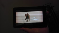 Android app for it, I went into the Amazon Prime area. I happen to also be an Amazon Prime user, so I was able to quickly access its library of many thousands of videos. I watched a couple minutes of Kevin Costner's "Postman" and the app, media and device performed seemlessly. The video was smooth, audio clear and I wasn't even using headphones, just listening through the on-device speakers.
From there, I went to the Android marketplace and installed a few apps and even downloaded a few not in Amazon store, to see how non Amazon-store apps would work. Answer- perfect! Android apps work well on this device, which of course is an Android tablet. I ran WorshipTeam.com app and it was crisp and responsive.
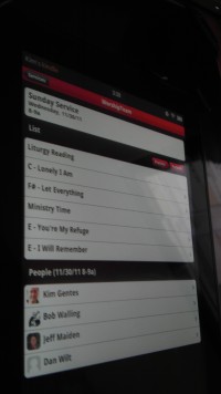 Overall, I like the Fire a lot. Primarily, the UI is its biggest advantage. Smaller than the iPad, it makes a book reading experience work, where the iPad is cumbersome. Movie view is good, though smaller than the iPad. For large app experiences, like car racing, the iPad is nicer, but for practical usages, the Kindle Fire seems well suited and nicely sized. While this device won't eclipse the iPad for now, it is a huge step forward to a functional, easy-to-use, and perfectly sized tablet. The preloading and easy connection of Amazon content is a long term combo-punch that iTunes can't match yet. iTunes is fine, but ultimately Amazon truly seems to understand content better than Apple, from books, ebooks, movies and music. As they catch up with their device, I think you will see that content becomes the ultimately powerful propellant to growing this new tablet ecosystem.
Win Amazon. I highly recommend it!
Amazon Link: Kindle Fire, Full Color 7" Multi-touch Display, Wi-Fi
Review by Kim Gentes.
 Kim Gentes |
  5 Comments |
  OS,
OS,  amazon,
  amazon.com,
  android,
  apps,
apps,  fire,
fire,  ipad,
ipad,  kindle,
  mobile,
  music,
  tablet,
  worship in
  Amazon,
  Android,
  App,
App,  Blog,
Blog,  Device,
  Flash,
  Hardware,
  Kindle,
  Kindle Fire,
  Media,
  Mobile,
  Planning Tools,
  Review,
  Social Media,
  Web Applications,
  Web Service - Music,
  Web Service - Video,
  iPad
iPad WorshipTeam.com Music "Perform" function - Chord Chart & Lyric display (Kim Gentes / Worship Tech Blog)
 Saturday, April 9, 2011 at 4:50PM
  WorshipTeam.com updated its service to add a nice new feature for those who love using chord charts and songs from WorshipTeam.com.
For iPad or android tablet owners, check out the new "perform" function now online in the new UI on the mobile site. The goal of the "Perform" button is to allow you to have a simple, clean interface with readable chord charts displayed allowing you to page through them, just like you would for a physical songbook on a music stand. Great for use on a stage, in a small group or at home practicing. Your service/set is ready to go without having to print anything off. Here is is how to try it out --
- STEP 1: From your tablet or iPad go to http://m.worshipteam.com . Login and select the "Services" option to see your upcoming services.

- STEP 2: Go to one of your upcoming services on your schedule and select the "Perform" button.

- STEP 3: You will see the first song appear. Controls on the top right allow you to page through the songs. You can also use motion/swipe to move through the songs.

- STEP 4: Formatting controls are at the bottom of the page if you would like different font and size properties. Note that you can turn chords on or off, depending on your needs (vocalists often only want lyrics displayed for example).

The music perform function works great on iPads used as music stands (as can be done easily b mounts like iKlip (http://www.ikmultimedia.com/iklip/features/), GigEasy (http://www.thegigeasy.com/) or Griffin iPad music stand mounts (http://www.griffintechnology.com/products/mic-stand-mount).
The music perform function is free with WorshipTeam.com and does not cost extra. Any WorshipTeam.com user can use this function.
bless you!
Kim Gentes
 Kim Gentes |
  2 Comments |
  android,
  chord charts,
  display,
  ipad,
ipad,  lyrics,
  mobile,
  music,
  planner,
  stand,
  tablet,
  worship,
  worshipteam.com in
  App,
App,  Display Presentation,
  Guitar,
  Hardware,
  Mobile,
  Music Training,
  Planning Tools,
  Print Music,
  Software,
  Web Applications,
  Web Service,
  iPad,
iPad,  iPhone
 WorshipTeam.com Mobile get LOUD- Full Audio NOW ONLINE!
 Saturday, July 18, 2009 at 7:45AM
 New update: WT Mobile just added mobile audio to the feature list! Streamed directly to your mobile device, this is Worshipteam.com for your mobile-- and it rocks! No more burning CDs or such.. Just get the audio right on your mobile device for practicing and learning songs!
You can get more info at www.worshipteam.com
 audio,
  blackberry,
  iphone,
  mobile,
  stream,
  team,
team,  worship,
  worship team in
  Planning Tools,
  Web,
Web,  Web Service,
  Web Service - Music
 WorshipTeam.com goes Mobile - iPhone, Blackberry, and more!
 Friday, June 26, 2009 at 4:43PM
  WorshipTeam.com made a big announcement today! They have added mobile access to their platform. I have tested it out and I love it. It's fast, sharply formatted and summed up nicely for mobile brevity. Of course, since I am involved with Worshipteam.com itself, I might be considered biased. But here is the great thing--- WT Mobile comes free with your Worshipteam.com subscription. It does not cost extra! Not only that, you can use it while still checking out Worshipteam.com for free during your TRIAL! Full function of paid subscriptions. So even if you don't have Worshipteam.com, try it out for a month for free, and be sure to check out the mobile feature as well. Here is the announcement below.
We are pleased to announce the launch of WT Mobile!
Now WorshipTeam.com is available on your iPhone, Blackberry, Windows Mobile or other smart phones and devices. With quick, easy access you will be able to view your upcoming events and sets. You can even view the lyric sheets/chord charts for songs in your set! Last minute phone calls or emails are a breeze with your teams contact information just a click away.
Simply type in "worshipteam.com" in your mobile web browser to get started with WT Mobile!
 Kim Gentes |
  1 Comment |
  blackberry,
  iphone,
  mobile,
  planner,
  team.worship team,
  worship,
  worship planner,
  worshipteam.com in
  Planning Tools,
  Web,
Web,  Web Service