Worship Tech Web Tools Blog
 This is an ongoing blog of web tools and technology related to worship, music and church. The idea is to give you good web points and resources that you can go to. Some of it is just me cruising the net, others are favorites of friends.
Enjoy what you see here. If you find an interesting, useful and technology related site or resource that deals with helping worship or musicians in general, please send us a note and we will check it out. Perhaps we can feature it here.
Thanks!
Enjoy! - Kim Gentes
Entries in apps (4)
Kindle Fire vs. Apple iPad - Two Tablets with Different Purposes (Kim Gentes/Worship Tech Blog)
 Thursday, November 17, 2011 at 3:18PM
 In a recent blog post, I wrote about my approval of the new Kindle Fire. I like it a lot! But immediately, I had people asking about the comparitive features of the iPad and how would I rate them. To be clear, the two devices are both tablets, and both aimed at consumers. But both have different focuses, and are clearly best applied to their given strengths. To explore this closer, I put together a short feature table below. Each of these items are just my feedback on each of the devices and their strengths. I own one of each, and am happy with both devices, but would use them differently, according to their strengths.
If you are looking at purchasing a device, consider what you are interested in using the device for and see which device leans towards the features you are most excited about.
iPad / Kindle Fire Comparison
 |  | ||
|---|---|---|---|
| eBook Reader |
10
|
7
|
|
| Web Surfing |
8
|
7
|
|
| Movie/Video |
6
|
8
|
|
| Music Player |
7
|
6
|
|
|
6
|
7
|
||
| File Sharing |
7
|
4
|
|
| Apps |
6
|
8
|
|
| Gaming |
6
|
7
|
|
| Size/Form Factor |
9
|
7
|
|
| User Interface |
8
|
7
|
|
| Performance |
7
|
8
|
|
| Typing/Editing |
6
|
8
|
|
| Battery |
6
|
6
|
|
| Price |
$199
|
$499
|
|
If you are interested in have a excellent ebook reading experience, web surfing, music playing (stereo speakers), sleek user interface and like small device size, then the Kindle Fire is in your strength list. If you are interested in watching movies, having a lot of custom apps usage, gaming usage, or want to take notes or data entry then the iPad is a strong device to consider.
What is also important to remember is this- the iPad and the Kindle Fire use the same essential hardware processor and architecture, but the iPad runs iOS and the Fire runs Android. The differences in iOS and Android propogate much of the technical comparisons of the two tablet- iOS runs more tightly and slightly better performance; Android runs with broader access to external connections (even USB ports) and file systems giving you easier access in such areas. Such technical considerations are not often important to general users, since apps are virtually becoming synonymous across both the iOS and Android platforms. But they are important to technical people and developers.
If you are user, use the device that meets your needs. Technical considerations are less the issue.
As with everything, utility is the king. At the price point of these two devices, it's important not to ignore your real functional requirements, since much can be saved (cost-wise) if you lean more to the Kindle Fire and it meets your needs. But if you must have the strengths of the iPad on your side, be sure you are ready to pay 2.5 times more for the Apple brand.
Kim Gentes
New Kindle Lights The Fire (Kim Gentes/Worship Tech Blog)
 Tuesday, November 15, 2011 at 3:18PM
 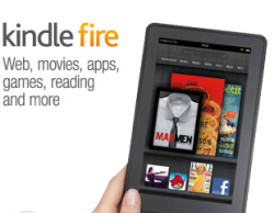 There is no denying it, Apple has been the uncontested monster at consumer devices in the last decade, with iPods, iPhones and iPads. With few flops, save the Apple TV (twice), Steve Jobs and co have led the revolution of simplicity and elegance on designed electronic goods. And frankly, they have opened up new markets that told the customers what they should have, instead of trying to make tweeks to the current world of electronics as they were. So that was the last 10 years. But now, with Jobs gone, what does the next 10 years look like.
Perhaps, not "more of the same", if Amazon has anything to say about it. In fact, with the launch of their latest device Amazon looks like they have finally decided to weigh in, and weigh in heavily, on the device market. Not satisfied with having the world's most popular ebook reader, Amazon has launched a new line of Kindle devices that compete head-on with real tablets. Here is my review of the first version of that device.
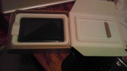 Today is November 15. It is a significant day for many other reasons, but one small reason is the arrival of the new Kindle Fire, personal tablet from Amazon. I had preordered the tablet for work reasons, but was anxious to get it open running as soon as the UPS man rang the doorbell.
The unveiling of my new Kindle Fire repeats a theme that has been taught well by Apple- simplicity. But Amazon takes this theme and perfects it, and expounds on its uses in a broader context. The shipping box containing the Fire was simple and well packed (all with eco-conscious packaging), as is most everything Amazon does in fulfillment. 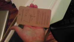 Popping the box open revealed the device (and a small power chord) and a simple sleeve box top. Inside the sleeve was a simple paper card, containing literally 5 simple sentences of instructions. No monster guide, no thing "getting started" manual, just a single card with a big picture and less than a handful of words (which all fit, nicely, in my hand). User guide? Who needs a user guide- this is the new Kindle. OK. Prove it.
The device itself is all black (mine anyways) with just one physical button (power), a single USB connector/power port and a mini-jack for audio. All located at the base of the portrait-held device. There are shallow indentations at the top edge for the audio speakers. The back of the device is a grippy, rubberized cover. Nice tactile surface, 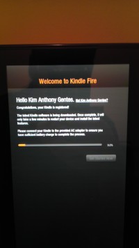 that doesn't slip from your hand and isn't rounded, unlike the iPad 1 whose rounded aluminum back was always slipping and pushing away from the user. Physically, the Amazon Fire form factor is literally 1/2 the size of iPad 1. However, the screen size of the Fire is only about 75% of height and 2/3 of the width, so you are still losing significant screen size, but it feels still large enough for use in your hands.
Booting it up, the Kindle Fire was ready to go by immediately powering up when I plugged it in. And the question to get going on the device quickly had me choosing a network and time zone.
Next came the fun surprise of seeing that the device recognized its owner without me doing anything. Presumably the device was tethered to my purchase account somehow, and immediately recognized who was the owner. Regardless of how this happened, the device customized itself to me and quickly loaded its updates and my own content connections.
On first opening of the device, initial "welcome" guides show how to use the basic functions of the device. In two or three easy arrows I was ready to run and rock with my Fire.
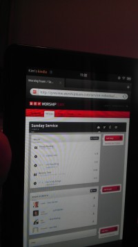 Quickly, I jumped around to see all my kindle books (from my previous purchases of kindle books on the iPad app), all my audiobooks and Amazon cloud music was all available on this device. Some initial download time would get content, but all was accessible without extra logging in or such. Love it.
I quickly went to the web browser and walked through a number of sites, including our favorite, WorshipTeam.com. The Kindle Fire performed excellent on all fronts. Websites with HTML5 and Flash worked perfectly and the performance was snappy. Battery seems to be charged close to top when you get the device, but I topped it off. After five hours of playing media and websites and even videos, the device was still at 84%. Not sure what its battery specs are, but it seems pretty decent on heavy media usage. My version has 6.5Gb of storage, and I began downloading things to it.
After testing out some WorshipTeam.com functions, including the 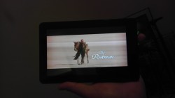 Android app for it, I went into the Amazon Prime area. I happen to also be an Amazon Prime user, so I was able to quickly access its library of many thousands of videos. I watched a couple minutes of Kevin Costner's "Postman" and the app, media and device performed seemlessly. The video was smooth, audio clear and I wasn't even using headphones, just listening through the on-device speakers.
From there, I went to the Android marketplace and installed a few apps and even downloaded a few not in Amazon store, to see how non Amazon-store apps would work. Answer- perfect! Android apps work well on this device, which of course is an Android tablet. I ran WorshipTeam.com app and it was crisp and responsive.
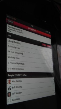 Overall, I like the Fire a lot. Primarily, the UI is its biggest advantage. Smaller than the iPad, it makes a book reading experience work, where the iPad is cumbersome. Movie view is good, though smaller than the iPad. For large app experiences, like car racing, the iPad is nicer, but for practical usages, the Kindle Fire seems well suited and nicely sized. While this device won't eclipse the iPad for now, it is a huge step forward to a functional, easy-to-use, and perfectly sized tablet. The preloading and easy connection of Amazon content is a long term combo-punch that iTunes can't match yet. iTunes is fine, but ultimately Amazon truly seems to understand content better than Apple, from books, ebooks, movies and music. As they catch up with their device, I think you will see that content becomes the ultimately powerful propellant to growing this new tablet ecosystem.
Win Amazon. I highly recommend it!
Amazon Link: Kindle Fire, Full Color 7" Multi-touch Display, Wi-Fi
Review by Kim Gentes.
 Kim Gentes |
  5 Comments |
  OS,
OS,  amazon,
  amazon.com,
  android,
  apps,
apps,  fire,
fire,  ipad,
ipad,  kindle,
  mobile,
  music,
  tablet,
  worship in
  Amazon,
  Android,
  App,
App,  Blog,
Blog,  Device,
  Flash,
  Hardware,
  Kindle,
  Kindle Fire,
  Media,
  Mobile,
  Planning Tools,
  Review,
  Social Media,
  Web Applications,
  Web Service - Music,
  Web Service - Video,
  iPad
iPad Internet, Music and Math: How to Waste Time With Three Fun Things (Kim Gentes / Worship Tech Blog)
 Wednesday, June 22, 2011 at 8:51PM
  Remember the promises of science fiction? Well, things haven't turned out quite the way the Jetsons promised us. When they said "Flying cars, robotic servants, instant meals", we didn't know they meant "Southwest Airlines, automated sales calls to our cell phones, and McDonald's happy meals". But who's to blame? Well certainly not Batuhan Bozkurt.
Batuhan is a "sound artist" and programmer living in Istanbul, Turkey. And he has done his part in bringing forth the joyous reality of that fantasy of almost all great science fiction- the fusion of technology and art. But is it that hoped-for utopia where ones own thoughts of melodies were enough for mind-reading computers to generate the symphonic masterpeices of the future? Mr. Bozkurt doesn't promise such glorious realities, but he takes the needed baby-steps for our neophite, web-connected world. He calls it Otomata.
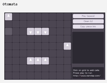
Quite simply, Otomata, is a sound generation web application. It generates tones based on a 9x9 grid which contains any number of bouncing boxes. You start with a blank grid. You add your boxes. You click play. The fun begins.
This might seem trivial (and it is), but Otomata is based on the same rules of operation that most iOS apps and even the first video game (Pong) held to- collision and redirection. The boxes you place on the grid all move, in any of the 4 directions you instruct them to. When they hit another box or a wall they alter direction. When they hit a wall, they emit a sound. The grid is set up in a specific musical configuration so that notes ascend a scale from left to right. You get the idea quickly. You develop patterns that create sound loops for basic rhythm and meter. Add some melodic chaos notes (boxes) to overlay said patterns of rhythm.
But the more complex you make them, the less sure you are of a clean results, or one that sounds musical (instead of an explosion of computer sounding blurps).
But enough talk. Try it out! Otomata is online, for all to try (apparantly, phone apps are in the works as well). You can go here and get started:
http://www.earslap.com/projectslab/otomata
Now for the really cool part. Once you develop an interesting pattern on Otomata, click the "Copy piece link" and you have the URL to your musical/web/grid configuration. Share it with your friends, build on each other's patterns. All very fun, time wasting and addictive. Real musos will initially bauk at this trivial tool, but finding the patterns is the key. Don't waste your time just throwing blocks on the board (at least don't keep doing it after 30 minutes or so). If you just do that, of course, you will be bored. Instead, start to develop a library of patterns that you can re-use for your bass end, your mid-chords and your high end rhythms. Then, start to mix and match and see what happens.
The app is online for anyone who has a web browser. Oh, a real web browser I mean- this one is in Flash, so you can't play it on iPads or iPhones (at least until they add Flash). However, the folks who wrote this online application have a great new port for the iOS devices and you can also download an app for your iPhone/iPod/iPad as well to take Otomata mobile.
Here are a couple patterns I worked on that I use as a base for more "compositions". Real music? Hmmm.. maybe not. But inventive, thoughtful, and certainly musical fun. You decide.
http://www.earslap.com/projectslab/otomata?q=4g3k5z4x0d0v7n7a8d8v
http://www.earslap.com/projectslab/otomata?q=3n4n5n3a4a5a8j0q177r
http://www.earslap.com/projectslab/otomata?q=3n4n5n3a4a5a8j0q
It's a fun time waster.. and your pattern recognition skills may just improve along the way!
Thanks Otomata! Thanks Batuhan Bozkurt!
Let's go people---
Go forth and blipify!
Kim Gentes
 Batuhan Bozkurt,
  apps,
apps,  internet,
  kim gentes,
  mathematics,
  music,
  otomata,
  patterns,
  synthesis,
  tone generation,
  web,
web,  website in
  App,
App,  Blog,
Blog,  Flash,
  Mac,
Mac,  Media,
  Music Training,
  PC,
PC,  Programming,
  Social Media,
  Software,
  Web,
Web,  Web Service - Music
 How To Block Apps From Posting To Your Facebook Wall
 Wednesday, March 3, 2010 at 8:36AM
  Why We Love/Hate Facebook
Let's be honest. We all love Facebook. We all hate Facebook. What's not to love about one place where all your various friends, family, acquaintances, work associates and relatives that live in far-away locations can all be within 15 seconds of your mouse clicks. What's not to hate about a data collection website that knows literally more about you and your behavior than just about anyone else (except maybe Google), including yourself.
But the one thing that finds the most heated angst from users is the pervasive and intrusive nature of the applications that are built into Facebook by third party developers (FB apps). Facebook apps have a particular kind of charm and power that make them exceedingly viral, and spread quickly when they are designed to catch the weary eye of users who have already spent 4 hours longer on Facebook than they should have in one day. If you think Facebook apps are all fun and you love them, you might consider this well-written (though a bit dated) article that is 99% dead-on regarding the problem with FB apps:
Exclusive: The next Facebook privacy scandal
http://www.cnet.com/8301-13739_1-9854409-46.html
OK, after taking a look at that, do you still want to keep those apps on your page? To be honest, the thing I hate most is NOT the privacy invasion (although I despise that, it is part of using the internet). The more evil thing in my mind is the constant annoyance of the APP posts to my wall- people throwing pillows, kisses and gifts that demand I respond back (which means I have to give them all my info to do so- since all APPs require it). That alone makes me wish I could band apps from my page forever. Well, it turns out you can. Almost. Here is what you can do.
Blocking FaceBook Apps That Post To Your Wall
First, each Facebook app has its own set of protocols and settings against those protocols. You can't ban all APPs in one fell swoop (Facebook knew that would be a deathknell of beautiful responsibility to its 3rd party apps-- far too user centric a move!). However, each time an APP posts something to your wall, you do have the ability to block it from ever doing that again.
Here is how to block an unwanted app:
STEP 1. When an APP makes a post to your wall or newsfeed, hover of the top right area of the region where the app posted to your wall. As you hover, you will notice an "x" appear. Click that "x", as you can see from the Family Tree post to my newsfeed below.

STEP 2. Once you have selected the "x", notice and select the "Block Application Name..." The phrase "Application Name" will be replaced by the name of the application you are dealing with- for example in our example here, it is Family Tree.

STEP 3. Of course, the app (Family Tree is our example) wants to be certain you really don't love their excessive spam and e-vomit all over your screen, so they ask you for the obligatory confirmation.

STEP 4. Now you have blocked the app. You will note that POSTS from the app are now also gone from your newsfeed. No future posts will appear in your newsfeed either.
STEP 5. Repeat. Each time a new app appears on your wall or newsfeed in Facebook you can repeat this process to block that app. Though there are hundreds of apps being used out there, only a few are used extensively, so you will find it takes just a few days and you will have encountered 99% of the apps that you will want to ban from your pages. Yahh! for blocking! Yahh!!
You are free! Free at last! Thank God! Free at last!
Doing my part to set the Facebook captives free,
Kim Gentes
 Kim Gentes |
  3 Comments |
  applications,
  apps,
apps,  block,
  blocking,
  facebook,
  mafia wars,
  posting,
  wall in
  Facebook,
  Media,
  Social Media,
  Web Applications,
  Web Service